Color
Designing a working color system for a global technology brand is no simple task.
Seeing green.
From the beginning, Uber Eats had always been about green. Green is the color of gardens, herbs, produce, and tea. The right shade of green feels approachable and friendly, like a courier delivering a warm meal, or friends sharing a picnic in a sun-drenched park. Green also means “go,” the color of movement. It’s positive and action-oriented. The right shade of green puts food in motion.
Green means go.
Picking a hero brand color for Uber Eats wasn’t easy. It had to perform well on both black and white—the dominant colors of the Uber master brand—while still being visually accessible to the vision impaired on multiple devices. It also had to feel rich when printed on craft paper bags, delivery cases, posters, and illustrated art. On top of all that, it had to accomplish all this while still feeling fresh, organic, and food friendly.
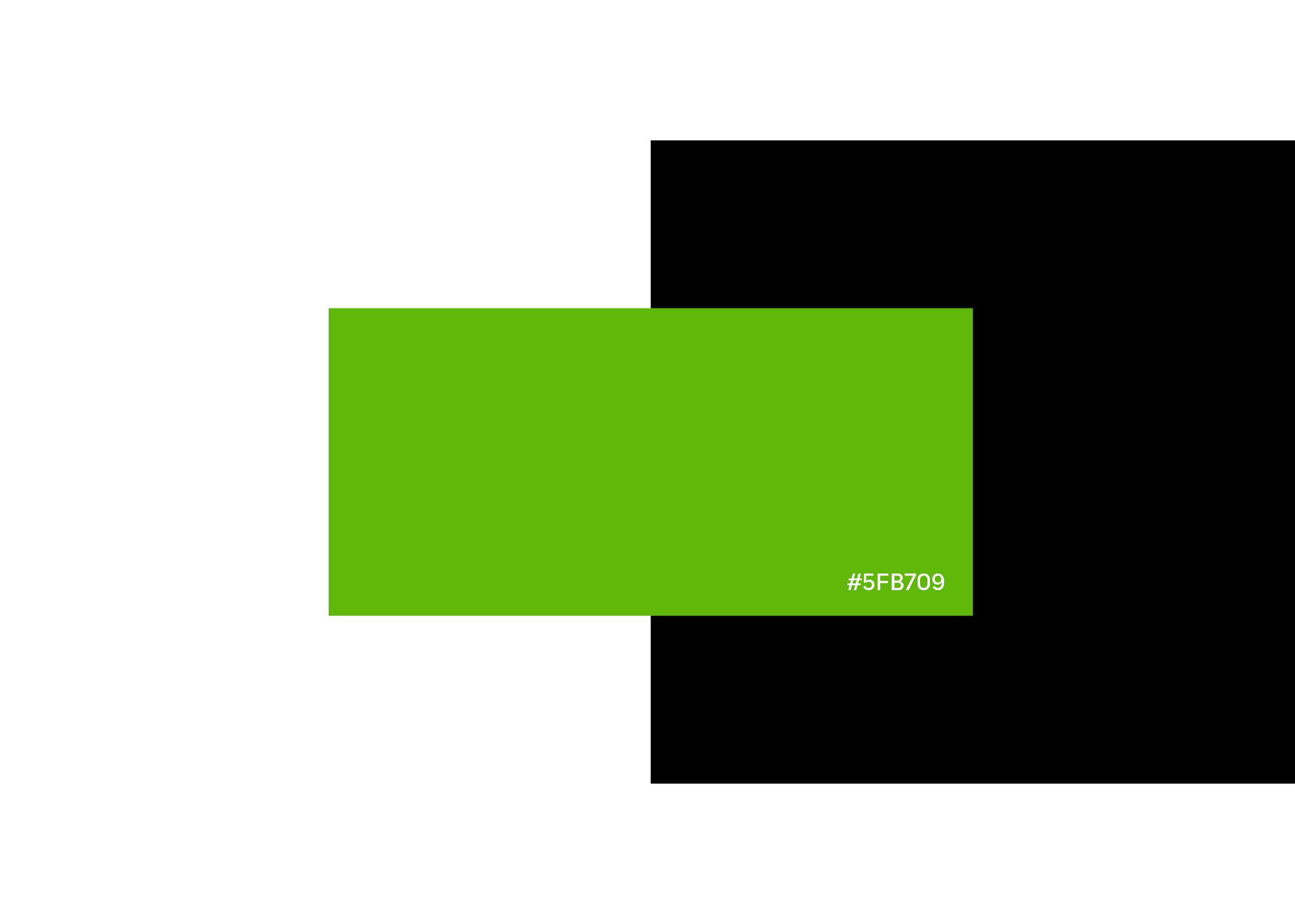
Going, going...green!
We tested well over a thousand different shades of green before we landed on the Uber Eats hero color. It wasn’t easy. To get there, we consulted product designers, illustrators, engineers, brand leaders in every business unit, marketing managers, color psychologists, print specialists, and countless others stakeholders. In the end, the green we found represented a rich new take on our Eats heritage, something that felt functional, fresh, and fun.

Expansive color.
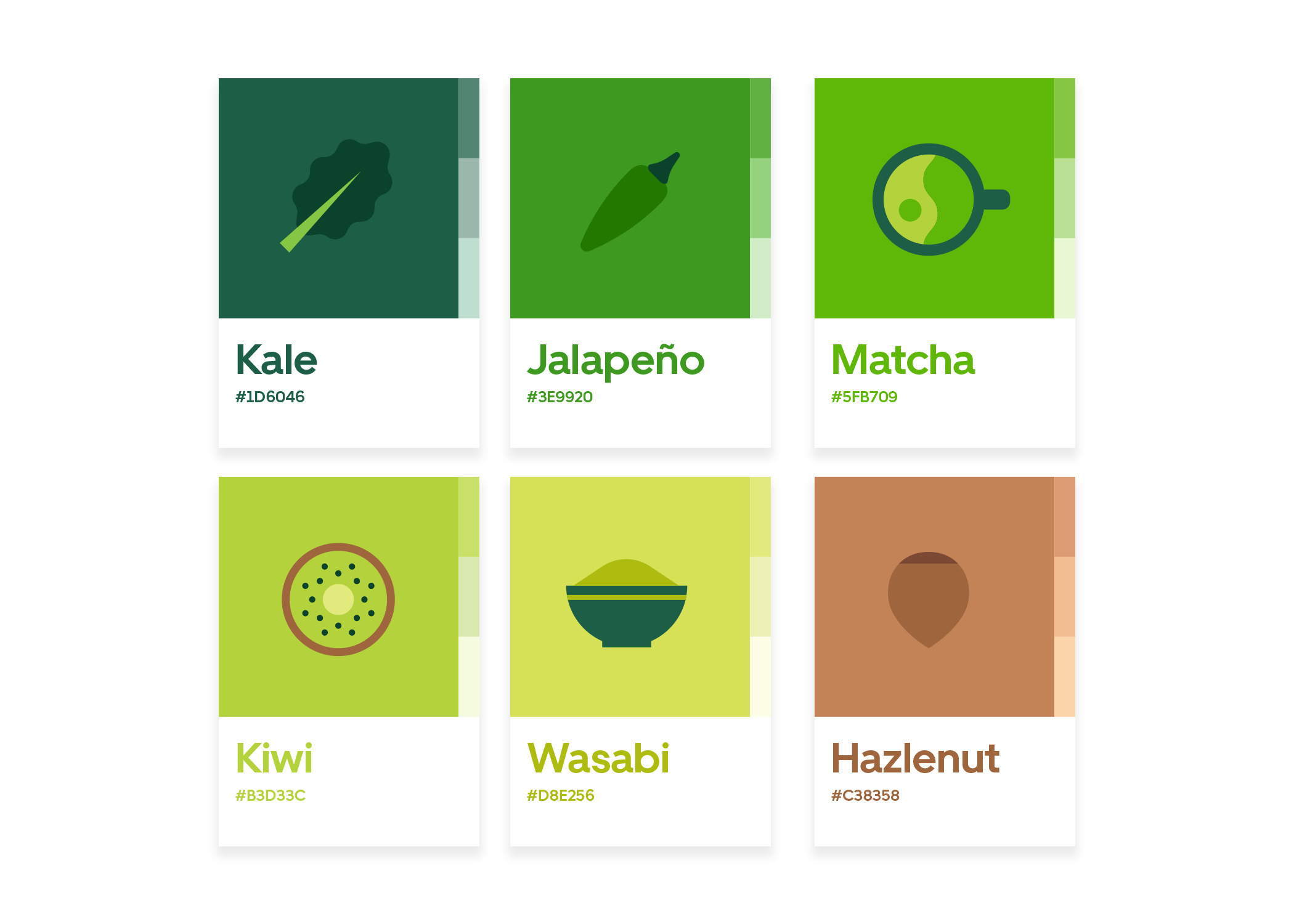
After finding our hero green, we began developing a brand palette that worked in unison with our new logo. The new palette needed to provide a range of functions for printers, product designers, illustrators, and engineers, while still offering a range of emotions for our new Eats brand.
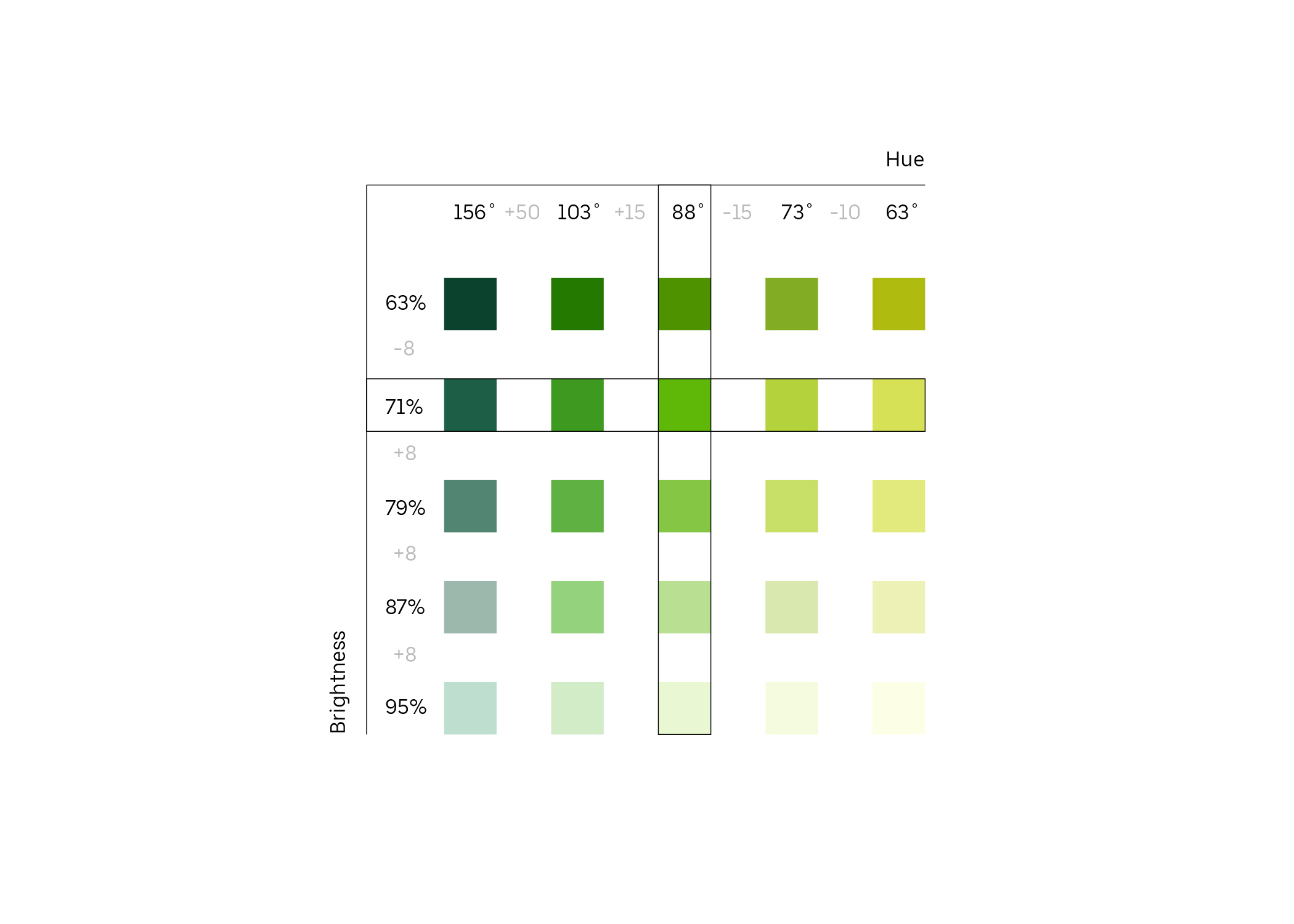
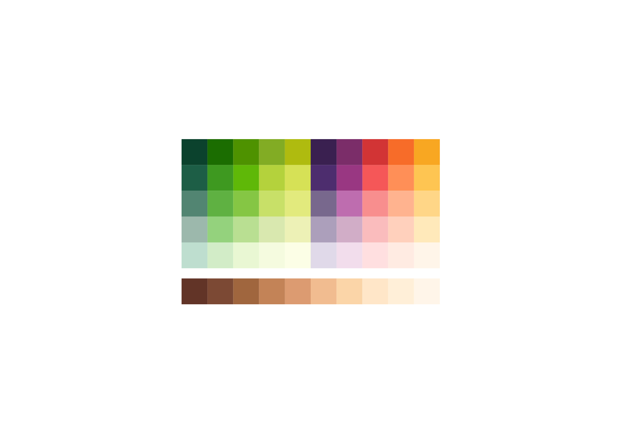
To expand the palette and create a tool belt for the entire Uber organization, we developed a formula that connected a range of shades under a single system. A careful consideration of hue and brightness allowed the new family of greens to serve a limitless list of needs.

On the one hand, we were building a library of colors that everyone across Uber could utilize for their design needs… but we were also building a library of feelings and moods.

Red light, green light.
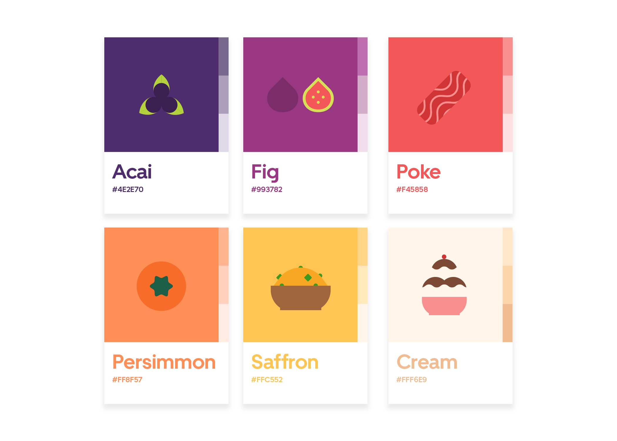
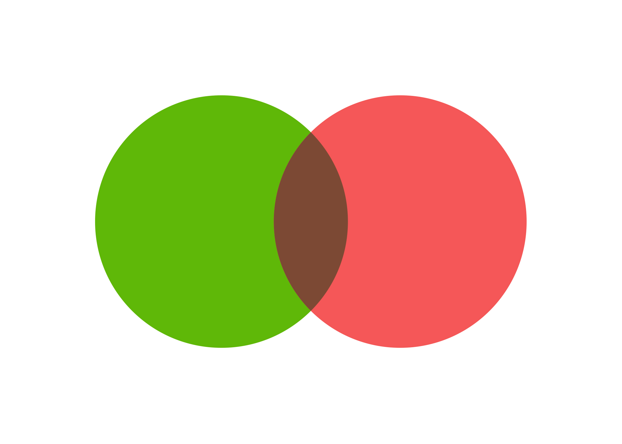
Our brand was not just green, however, and with our primary palette completed, we needed a secondary palette to compensate for the enormous variety of foods, cuisines, cultures, and markets. We began building our secondary palette by taking the opposite shade of our hero green—a vivid salmon red—and starting the foundation for a flexible complementary system.
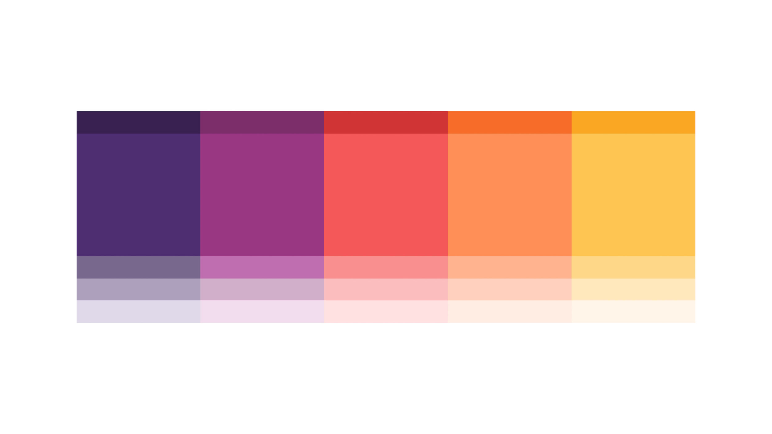
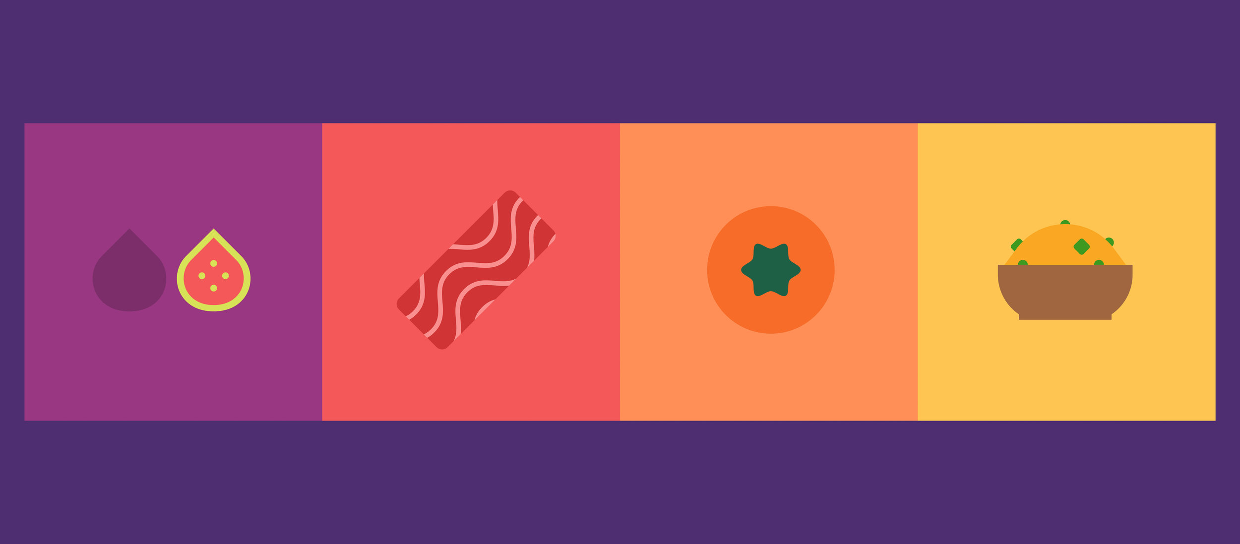
Using a similar formula to our green system, the complementary palette expanded to accommodate a greater variety of hues. All the colors were inspired by natural, organic tones found in real food.

We wanted our palette to feel ripe, fresh, vivid, and whole. Deep, saturated tones produce flavorful imagery.
Brown in between.
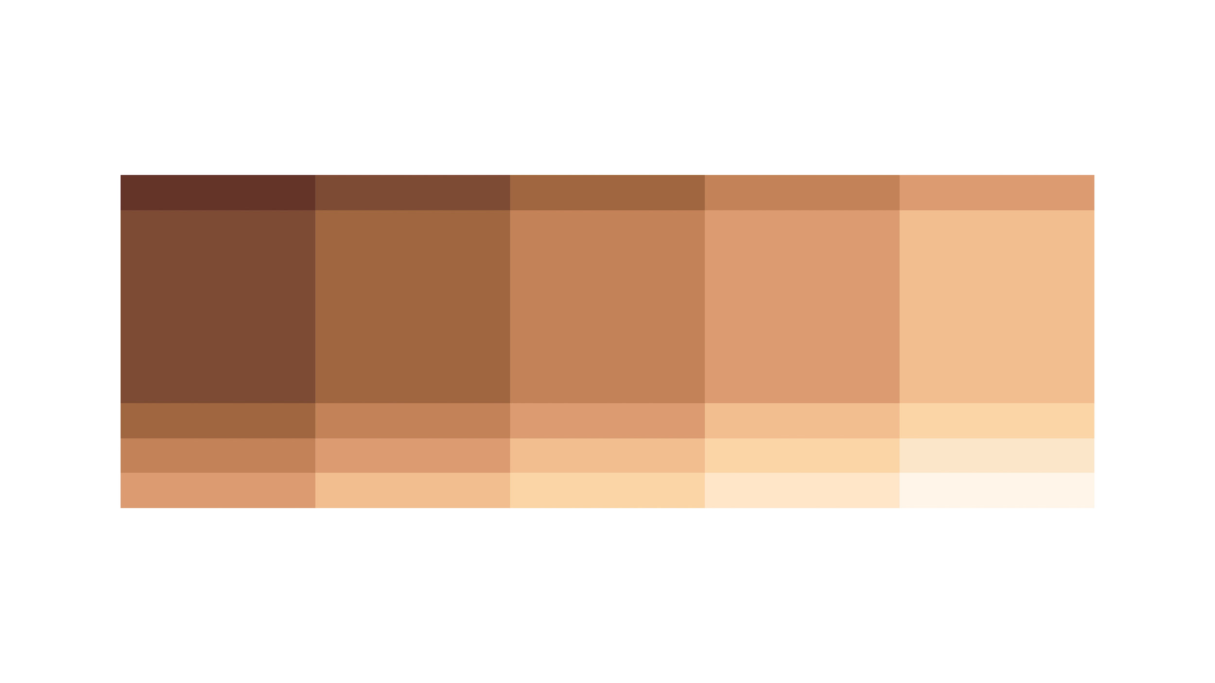
With such an intense, saturated system, we need to balance our palettes with a selection of neutrals. Brown represented to obvious choice—the grainy, nutty, chocolate world of food demanded an earthy garnish. A third palette, inspired by combining our two hero colors, began to emerge.
The name game.
Now that we had built a workable color palette for Uber Eats, the fun really began! To match color appropriately all over the world, we needed to systemize the colors for use between teams, offices, and vendors. Since the entire palette was inspired by food, we decided to capture the essence of each color by naming the various shades after food items. This really brought the library to life.
